Low Light Photography

lightbulb

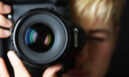
Low light photography can come in many different places. You could be inside, especially in a gym, and realize that there isn’t enough light to really capture the moment. At the same time, you could be outside and not be able to see anything except the sky. These are some helpful camera tips to help make your low light pictures even better.

Of course step number one is to try to get as close to a light source as you can. If you are taking a picture of a group, try having them stand under an actual light. It is the easiest way to get more light in a picture.

Try shooting in the raw. This kind of picture is easier to work with, but it will take up more space. It will make it easier to take into Photoshop or your photo editing software and fix it how you see fit. It is also easier to recover details if you over or under expose the picture. This is great when you are working with low light because you do not have to have your camera settings perfect and you can still get great details.

Set the ISO up as high as it can go. ISO is what deals with light. The higher the ISO, the faster the shutter will capture the image. If you have an ISO of 3200, the shutter speed will be 1/32 of a second. This will capture a lot of light in a quick time. Set your ISO high so you can get a quick burst and capture a lot of details. In order to do this, you will probably need to have a tripod with you. You have to hold your camera extremely still, and the best way to do this is to put your camera on a tripod. Pack one in your bag just in case you need it.

Also, low lighting places can set you up for some dramatic and interesting shots. If you can’t seem to get details of people, think about shadows you can get. A player going up for a rebound on the basketball court might be a very interesting image for a divider page. Get creative with your shots and think about how a back light might help you, rather than hinder the shot you were expecting.

These are just a few tips in order to help you shoot in low light areas. There are a lot of tips you can find in order to make your photography even better, but these are some of the main ones. Before you shoot in low light areas, make sure you have the equipment you need. Tripods, flash, and lenses are a must. Always be prepared when shooting in all kinds of conditions. It will not only make you feel better, but it will make your pictures look better.

Black and White VS. Color Photography

cVSbw

There is a major difference between black and white and color photography. Photography plays a key part in not only yearbook and journalism, but also how the world sees things. In a world of applying different filters to photographs, you should know when to use black and white and when to use color.

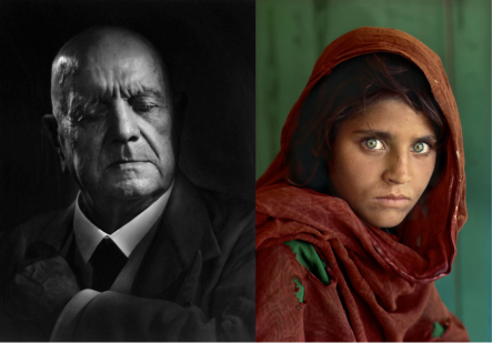
Color photography appears most everywhere now in the world. Regardless of where you look, you see bright and vivid color photography. There is a time and place to use this specific medium. Of course most of your books are going to use color, and that is wonderful! If you are trying to give the photo more details, color might be your best bet. Color can connect more dots for your audience. Look at the photo above on the right. This picture was taken by Steve McCury. Try to picture this image in black and white. You wouldn’t have as many details. Her red outfit stands out on the green background. They you continue to look around the image. Her eyes really pull you in and make you want to look deeper into the picture. Of course this photo might be strong in black and white, the photographer wants you to have those details. You really want to use color when there are distinct hues that you want your audience to see. Think about someone sitting in an art class, you want to get an overhead shot of someone painting with their open paint containers all around them. It will be much more pleasing if it is in color.

Black and white photography, while it may be an older form of photography, is still frequently used. This will produce a more timeless photograph. It also makes shadows stand out more. The picture on the top left, taken by Yusuf Karsh, is more dramatic in black and white than it would be in color. Try to picture the image in color. You would lose some of the emphasis on his facial lines. You may also be drawn to the color of his suit rather than the subject itself. Black and white usually adds a lot more drama and depth to a photo. Think about a Friday night football game and out of nowhere is starts raining. While it might be cool in color, the drama of the rain in the lights and the glimmer of the helmets might make this photo more pleasing to the viewer.

While most of your book will probably be in color, keep in mind the thought of black and white. It might help you boost the photography in your book to have both forms. You could use color on the spreads through the book and only use black and white on the divider pages or the intro and closing. It could make your pages stronger. When you go out and photograph or you think your photo could be better, try switching between the two. It can only help your photography.


Post by : Hannah Funderburg

News Values

UntitledWhen you are covering a story, there are things to keep in mind. One of them is news value. News Value determines how much prominence a news story has. This applies to not only the media, but also the audience. This usually does apply to only news outlets but it can also be applied to your yearbook stories. The main point of news value is to make sure your stories are what people want to read and strengthen your writing.

The first one is Impact. You want to make your audience care. Cover stories that people will want to remember years down the road. Write about what impacted your year. This can range from a new administrator, to life events within the student population. People want to read about things that are affecting your peers and it will make it even more personal. Positive impactful stories are what people want to remember and a major reason why we have yearbooks. Think about covering how someone overcame an obstacle rather than what was served for lunch on a specific day.

The next one is proximity. This one should not be too hard considering that you mostly would be covering events happening in your school. The closer you are to the story, the more newsworthy it is. You want to localize the story. People will not be interested in a story that happens across the country unless it impacts your school in some way. The closer to “home” it is, the more people will want to read it.

Timeliness is also big in news value. You want to cover the story as quickly as possible. If a team just won a major game or you had a record crowd at a play, talk to the students involved as soon as you can. You will be able to capture a lot more emotion if you ask them about it that day rather than a month later. It will make for a more interesting read if you can also capture emotion.

Prominence is something else to keep in mind. We all know that names make news but let’s be honest, you aren’t going to remember who did what in thirty years. If someone does something that is major for your school, include their name and what they did. If they are important to the story, their name has to be included. You can really take prominence as you want. Remember that you are trying to include everyone in the book so try to mix it up as well as include the key leaders.

Conflict is another one that you can take as you want. People fight about the issues they care about. Conflict in yearbook coverage could be about events between your rivalry school. This could range from a game to blood and food drives. Another idea would be if your school is fighting for something on an upcoming ballot. Do not cover conflicts that you do not want to see in thirty years. Remember to keep these things relevant.

The last news value idea is novelty. These are usually funny, unusual and bizarre stories. These are to break up a lot of “heavy” news that could happen. These funny stories could happen anywhere. These could be embarrassing moments, funny stories from an event, or something silly that happened at a pep rally. These lite-hearted stories will provide entertainment for others.

News values are a good way to keep the audience interested and to improve your stories and writing. These can be applied to any story you ever cover and write, not just in the yearbook world. These elements can really improve your coverage of events. Keep them in mind next time you have to cover a story!


Post by: Hannah Funderburg

How to use Text: Part 3

justmytypeface

This is the third and final post about how to properly use text! Make sure to check out the first two if you haven’t already.

13. Be careful with reverse type. This is when you put a light color on a dark background and vice versa. This should really only be used for headlines because those will be the easiest to read. Also think about the type color and font selection. Some colors, like red and blue, are hard to read on top of each other. Also, a fancy script font will frustrate the reader. A thick font with simple colors is the way to go.

14.Watch your leading! Leading in the space between the lines. When typefaces are designed, they usually have a slightly larger space than the point size, this is to help with legibility. If your body copy looks like it is all squished together and it is hard to read, consider increasing the leading in between the lines. It will make it easier to read.

15.Is your work legible? This is referring to how well short bursts of information are read, such as names. You do not want a typeface that is not legible. Pick something that is easy and quick to read. If not, your reader will become bored and frustrated and not want to figure out what is trying to be said.

16.Be aware of line breaks. These are where a word at the end of a line is broken into syllables and hyphenated. When a your audience is reading, they will pause at line breaks as their eye moves to the next line. This can cause an awkward break in the reading. Try to avoid these as much as you can. Add a word or two, adjust the font size, or kern to help fix this.

17.Know how and when to highlight. This can be very important for your audience. You want to show them the important information, but too much highlighting leads to confusion on what really is important. The rule of thumb is highlight ten percent of the page. Also, use a couple of highlighting tips at once such as a different color and typeface. Do not bold, underline, italic, change the color, size, and font all at one time. That’s doing way too much!

18. Understand and use your punctuation correctly. You should be able to know when to use what sort of punctuation. It can have a major impact on how your viewer reads the piece. You can use punctuation to break up sentences, add some pizzazz, and develop some interest, but make sure you are doing it correctly. You don’t want to end up saying something you didn’t mean. Make sure to proof read.


These are just eighteen helpful tips on how to spice up your text and create a more interesting page. Keep these in mind when you are laying out your pages and try a couple out! They will help if you use them wisely! Happy texting!


How to Use Text Part 2

Untitled

Part two of our three part how to use text series.

  1. Use small caps correctly. They tend to have a readability problem when put in large bodies of text. Typically small caps are used in the first sentence of a paragraph (such as “Once upon a time”) but also during abbreviations such as AM or PM. These are the only times they should really be used.
  2. It’s still a hard knock life for Orphans. Orphans in typography are single words that are left by themselves at the end of a paragraph. It is especially sad if it is a small word. It just looks awkward to leave a single word by itself so try rewording the sentence to keep the word with some friends!
  3. Consider a throwback…a throwback to old style that is! Old style refers to numbers that are written that go above or below the baseline where the rest of the text sits. Old style numbers often blend in better with the rest of the text and make your work look more professional. Not all type faces have an old face option so do your research before hand!
  4. Avoid the defaults! They are like the plague. Not really, but they are really common and are found everywhere. Show people that you know there are other options and choose a different type other than Times New Roman.
  5. Use two fonts. Most of the time, your work will look better if you work with two. One can be used for the headlines and the other can be used for body text, portrait names, and captions. Also, this is a good way to draw attention to something without making it bold. Two is a good number because they can be contrasting without overwhelming.
  6. Size does matter, so pay close attention to it! Everyone thinks 12 point font is the best way to go but it has been proven that our eye can handle smaller text sizes. Try a 10 point font. Also, think about what is most important. The headline should be bigger than the body copy because it’s purpose is to catch the readers’ attention.


Stay tuned for the final installment of how to use text next week!

18 Rules of Using Text: Part 1

Untitled

As great designers, you should know all about how different fonts work together and how to successfully execute them. With the next three posts, we will be taking a look at eighteen basic rules to keep in mind when choosing a typeface! Here are the first six!


  1. Know the font’s personality! Just like us, typefaces each have their own, and they are all unique. You may be thinking “yea, so?”, but when it comes down to it, you do not want to be using a goofy font on a serious page. Think about what the page is trying to tell the audience. If you are talking about a serious event, do not use a type with swirls in it. Use these for more fun and whimsical pages. Bold fonts often make things seem important, thinner fonts are more professional, and cursive families are more fancy. Think about the feeling of the page when choosing fonts.
  2. Steer away from Clichés. Some types have become so popular that even non-designers know what they are. Times New Roman for example is a universal typeface. Do not choose these to represent your whole book. Choose something that people do not look at everyday to keep the readers attention. You do not want your audience to read the book and be bored or think about a bad memory (like work or a paper they did poorly on). There are a lot of fonts that can be used in their place.
  3. Contrast font families. Using two typefaces in a must, but do not choose two that are too similar. When thinking of fonts, do not pick them from within the same family. Do not choose two script fonts to work next to each other. Pair a script with a serif. If you are going for a contrast, it looks silly if you choose two similar types.
  4. Do not use all caps! Designers can use different ways to show emphasis other than using all caps. Some examples are bolding words, changing the typefaces, using a different color for the emphasized text, increasing or decreasing the size. Plus the shape of the text box goes away and it just looks like a boring rectangle. You don’t want your readers to feel like you are yelling at them either.
  5. Create an ideal line length. Your audience is not going to want to read something that spans all the way across the page or is typed out one word at a time. There is a clever math trick to create the perfect line length. Take the point size of the font (12pt) multiply it by two (24) and then divide that number by six. Your line length should be about four inches long.
  6. Make sure you can actually read it! Yes, this is a funny point and many of you may be rolling your eyes, but it is a real thing! This relates to how large bodies of text are read. This is often affected by line length, type size, the space between the lines (leading), or even the space between the letters themselves (kerning). Keep these things in mind!

Check back in the next post for the next set of six tips! Happy yearbooking!

Why Have a Theme?

Untitled

We all know what themes are. They are the unifying idea that brings our book together. The question is, why do we have a theme? Why can’t we just put our book together and call it a day? The theme is what unifies the material you put in the book. They also keep the reader’s attention.

When you have a theme, whether you realize it or not, you create a unique product. The yearbook itself is just a shell; the theme is what brings it all together. It is a fresh and new idea brought to something that captures the year. Every year, the book theme changes and this is what makes people excited to buy the book. Keep it unique and break away from what you did in the past. People will be more excited to buy the book if you are breaking away from what has previously been done.

Also, if you have a theme, it is easier to make sure the book flows well. The parameters you set with the theme should help you. Sit down with your staff and lay it out in the beginning so you do not stray from the theme. Talk about type choices, colors, and the overall feel of the book before you actually work on it. It will be helpful to the staff and the end of the book will be unified with the beginning.

Your reader and the customers also like seeing the themes. Before you were on yearbook staff, think about when you first found out the theme. It was an exciting time to see how the book was connected with that certain year. Make the theme something new that no one has seen before. Adding fun modules and uniquely angled pictures can also help with mixing it up. Make the theme something that will grab the attention of people passing by. This is what will make them want to buy it.

Have fun with it though! Theme is a very daunting idea. You question if people will like it and if you are choosing the right one. Pick an idea and just run with it. Theme is meant to set up guidelines for you but be a lot of fun for everyone involved. If you do not like working with the theme you chose, chances are, the reader will be bored as well. Think about exciting and fun things happening that school year.

Theme is a major part of creating yearbooks. With this in mind, pick your theme wisely. Make it new and innovative. Capture the attention of your peers and community. It makes the book more entertaining and makes it stand out among past books. So when you are starting to think about your theme, think back when you first received your book and what made it all worth it

The History of Photography

Untitled

Joseph Niepce captured the first photograph in 1827. He used a camera obscura to expose the film. He later came to call these heliographs. These, however, were not permanent. His photographs required eight hours of light to expose and would fade away soon after taking the light away. He went on to figure out how to preserve the photographs on light sensitive paper. This was the start of something new in the world.

By the 1860’s photography had been well developed and was about to make history again. The American Civil War broke out in the spring of 1861. America was split between the Northern and Southern states. Many homes sent men to fight in the battles but no one really knew what the battles were like. The Civil War was the first war that was extensively photographed. These images brought the pain and the conflict to the people of the country. The use of the printing press also played a key role. The photographs that were taken could now be published in newspapers and be sent across the country. The photographs brought light to the subject of war and people could now see how it was affecting the country.

Many of you are probably wondering why any of this is important to the yearbook world we live in today? Take a second to think about what our yearbooks would be without photography or even photojournalism as a subject. If we took photographs like the first one, it would be a blurry picture of the school and that’s it. The picture itself would take a while to develop and who knows if we could even tell what it was. The Civil War brought on the idea of photojournalism, or bringing foreign events home. People could now see what was going on without actually having to be there, much like events in the yearbook.

If it was not for the photojournalism during the Civil War, the world of journalism may no have been as advanced. The photographs brought the war to people’s front doors. Photojournalists today do the same thing. They show raw emotion people do not get to see everyday. It is a way for people to relate to others around the world. It can also be used to make a point. It is something people cannot ignore. It captures a moment in time that can be very powerful. It brings humans together in a way that would not have possible without the invention of cameras and their use in the Civil War.

Think about this as you capture the events of the year. Think of the moments that you are going to want to look back on. You want to capture the emotions and events that not everyone might see. Happy capturing.

The 4 P’s of Marketing

marketing 4 p image

Welcome back to a new year and a new book!  I will be sending positive yearbook vibes your way all year!  With a new year, comes new blog posts. To kick things off this year, we will be talking about the 4 P’s of marketing. These are product (or service), place, price, and promotion. All four of these play a major part in the world of yearbooks. First, you need to know that marketing is having the right product, for the right people, at the right time. The more popular it is, the easier it is to market. You want to make something that people want.

The first P is product. This is obviously your finished book that the community will look at. You have to market it as more than just a book though. Yearbooks are a way to capture history. People only remember so much for so long, and that is where the books come in. You capture moments and stories people may forget or don’t know about. You need to think about how to market everything about the product to make the customer want it. How is the book branded? How is id different than last year’s book? Why should people spend money on it? These are all good questions to consider when thinking about the product and marketing it.

The next P is place. Where are you going to sell your book? Of course, the school is a major answer to this question. Your fellow students are the biggest costumers when it comes to the book, but what about the parents? Most parents are the ones who actually pay for the book. Think about where parents may be present, such as open houses, sporting events, shows or plays. These are all places you might already be covering so it shouldn’t be too hard to have a table there with order forms. Online orders can also fall under the place category.

Price is the third P.  The yearbooks hold a lot of value, even if people do not immediately see that, but you still need to try to set a price that is reasonable. People will not buy your product if it is over priced. One of the major complaints is that the books are too expensive. Let’s say you have a $75 book. These books usually last about forty years. If you divide $75 by forty, that’s only $1.88 a year. Tell your customers this. This simple math is often over looked. This is one marketing strategy you could use for price. Think of all of the memories you will have for only $1.88 a year! You could also offer discounts. Raise the price every couple of months and tell people it’s cheaper to buy them sooner rather than later. They do not want to miss out!

The last P is promotion.  How will you get all of your information out? Posters and signs are always a good place to start. You may also think about sending out a mailing or email to the parents. Also, consider when may be the best time to promote the book. A week before school ends might not be the best idea. Go into the year determined to sell as many as you can before a certain time. This is where you can set goals for yourselves. If you have a good promotion, you will sell more books, and can reward yourselves with a pizza party or something of that nature.

These are just four ideas to think of when you are stating to market your book. Everyone probably knows you have a yearbook, but the better you promote it and market it, the more you will sell! Have a wonderful year, we are all excited to be working with you to make this the best book yet!

Welcome, Summer

summer-tumblr-1

Ahh…the first Monday of June. How is it that the school year is over already? Did it fly by for everyone else, too?

Today’s post is a little of a mash-up! More tips based, than tutorial based…

  • Since it’s June, now is the time of year to finish up the 2014 yearbook, but also begin thinking about the 2015 yearbook. Schedule a wrap up day with your staffers to finish up pages, make those final edits, and publish the book or submit your last batch of pages. If you aren’t planning on attending the summer workshop in Athens, pull out the calendar and flip to August. When could you and your 2015 staff meet at school for a planning/training day? Would this be a day Lindsey, Danielle, or Jenny could come in and help?
  • You’ve submitted your exact copy count for the 2014 yearbook. You know exactly how many you’ve sold, and how many extras you’ve ordered. If you had an online store, you also know how many you have in reserve for summer sales. Now is the time to get a wait list ready to go for next year. Things will be chaotic in the fall with the start of school, let’s not forget this important fact of the wait list — let kids know there will be a rush on the extra copies you receive, and that it will be driven by that wait list. As usual, you’ll receive anywhere between 1 and 50 extra overrun copies of the book.
  • If you are a SmartPay school, contact Mary and/or Lindsey, Danielle, or Jenny, to get your 2015 store set up NOW! Each fall, all schools are rushing to get that store opened up, let’s beat that rush and get ahead of the game! This way, early bird order forms can be included in that back-to-school paperwork pile that goes home with the kids on the first day of school. Get a jump start on book sales next year.
  • How are you planning to distribute books when they arrive? Book distribution party? At schedule pick-up day? You and your staffers worked approximately 180 days on this book — on this creative work of art — shouldn’t it be celebrated? And shouldn’t order forms for the 2015 book be placed in every single copy that is passed out? (This is where you should be shaking your head “yes!”) If staffers create an event to pass out the book, the book becomes something even more special — students will talk about it, students will get excited about it, future book sales will increase because of it. Let’s make this an event to remember.
  • Will you be covering the summer in your 2015 book? Creating a yearbook Instagram account is a great way to continue to market the yearbook, but also to collect coverage topics from the summer months. How about a personalized hashtag for your yearbook? Students at the school can private message vacation photos to your account, stating that the yearbook has permission to use them in the book. We all know social media is a powerful tool, let’s use it to our advantage even during the summer!

Yearbook is a year-round gig… What other ideas do you have for post-planning and pre-planning? Share your ideas below in the comment section!

See you in Athens!